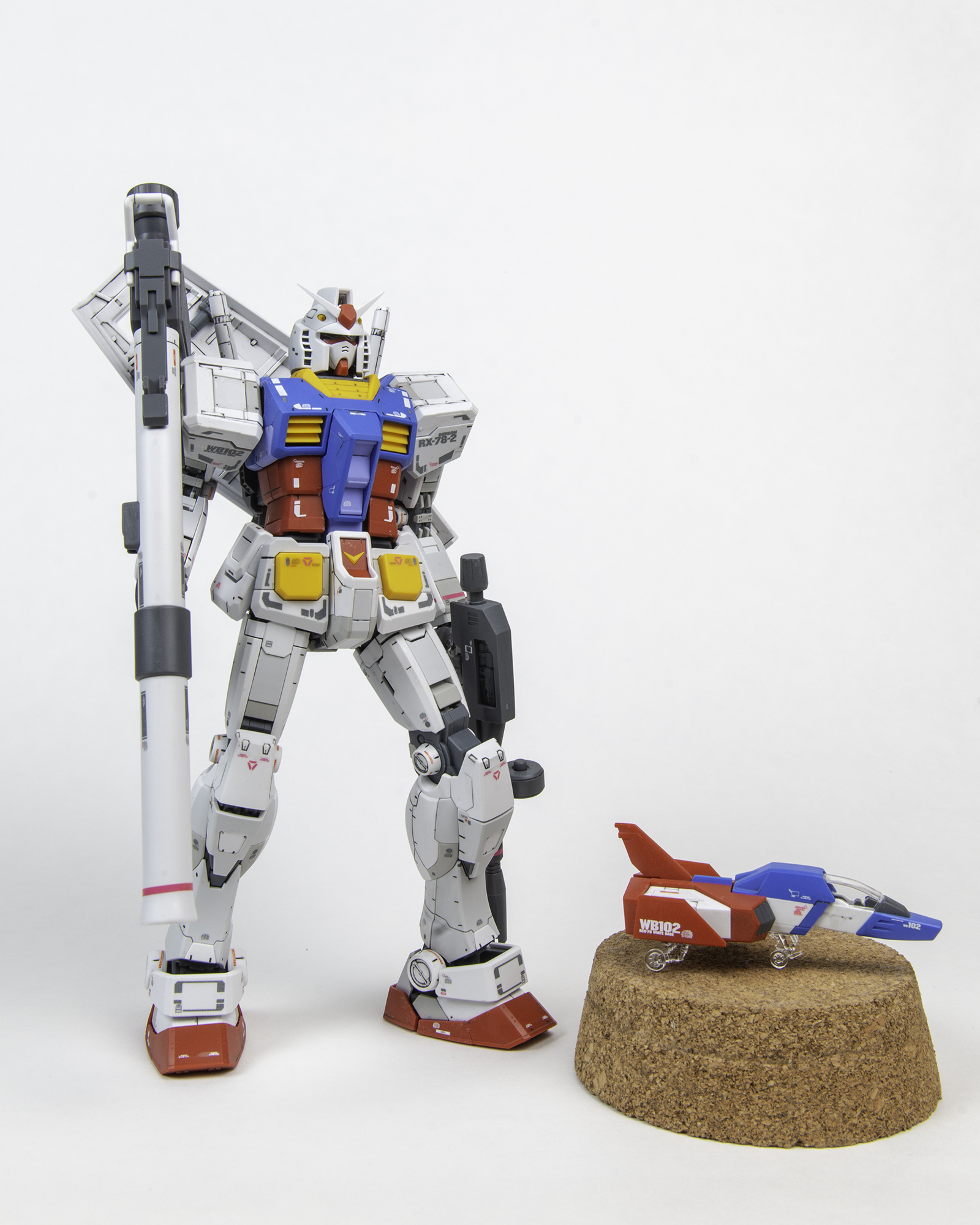
Bandai MG Gundam RX-78-2 Ver. 3.0 1/100 Scale Model Kit & Diorama
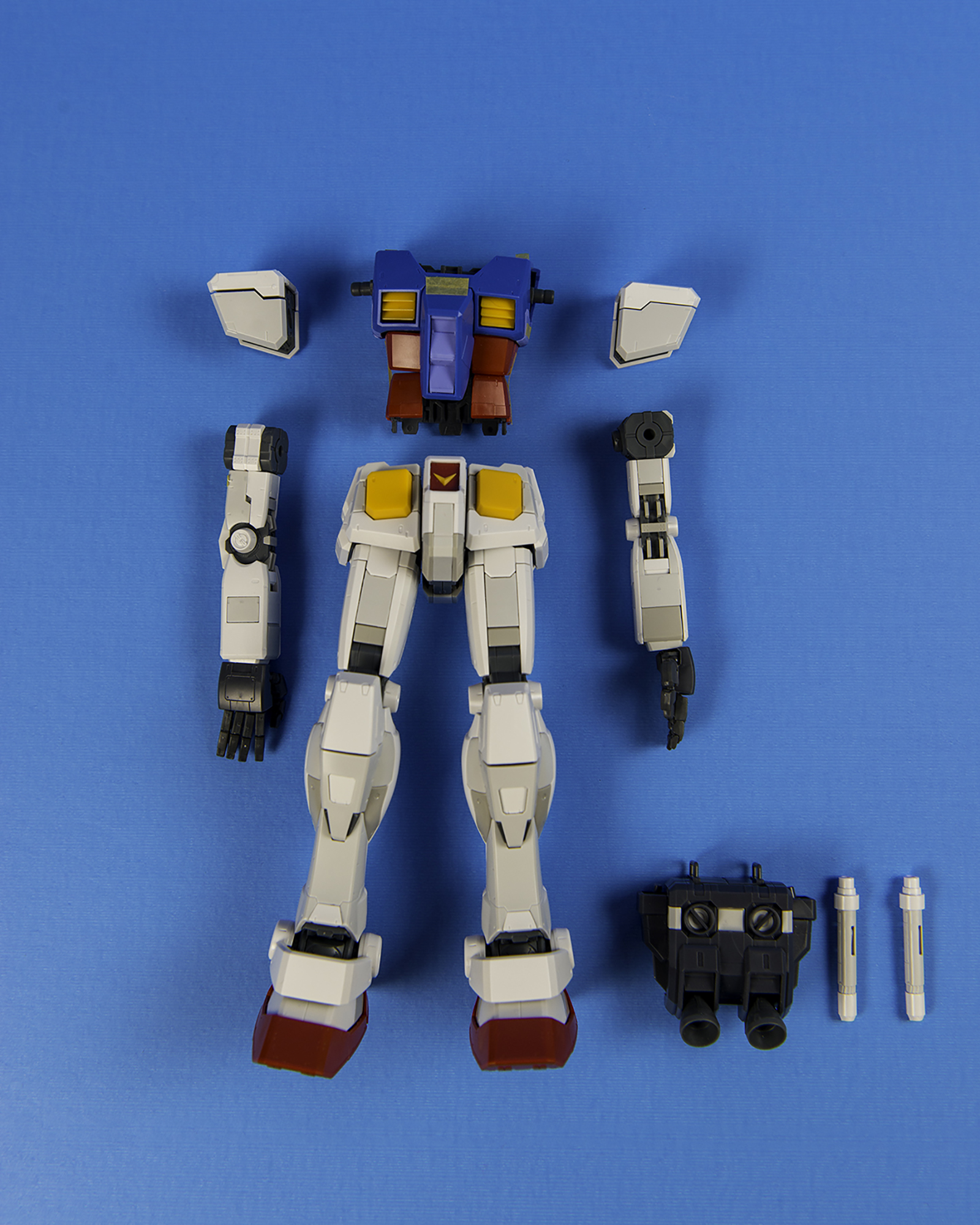
Partially built and put together for test fitting. In this beginning stage I’m looking at color separation and thinking about which parts will require masking and if there is any seam line repairs I may need to do.
Just looking at the kit from a bare bones, straight build perspective, I can say it’s a fantastic model. Very fun to put together, awesome mechanics and articulation, and amazing details.
DIORAMA SUPPLIES
Working with polystyrene: Creating a “Launchpad”
The initial idea I wanted to create was a space type launchpad that had a “hangar” kind of look. I wanted the launchpad to 1: Have texture and a mechanical look. 2: Be on an angle to look as if it was propelling the mobile suit upwards 3: To have some boosters for the feet of the Gundam.
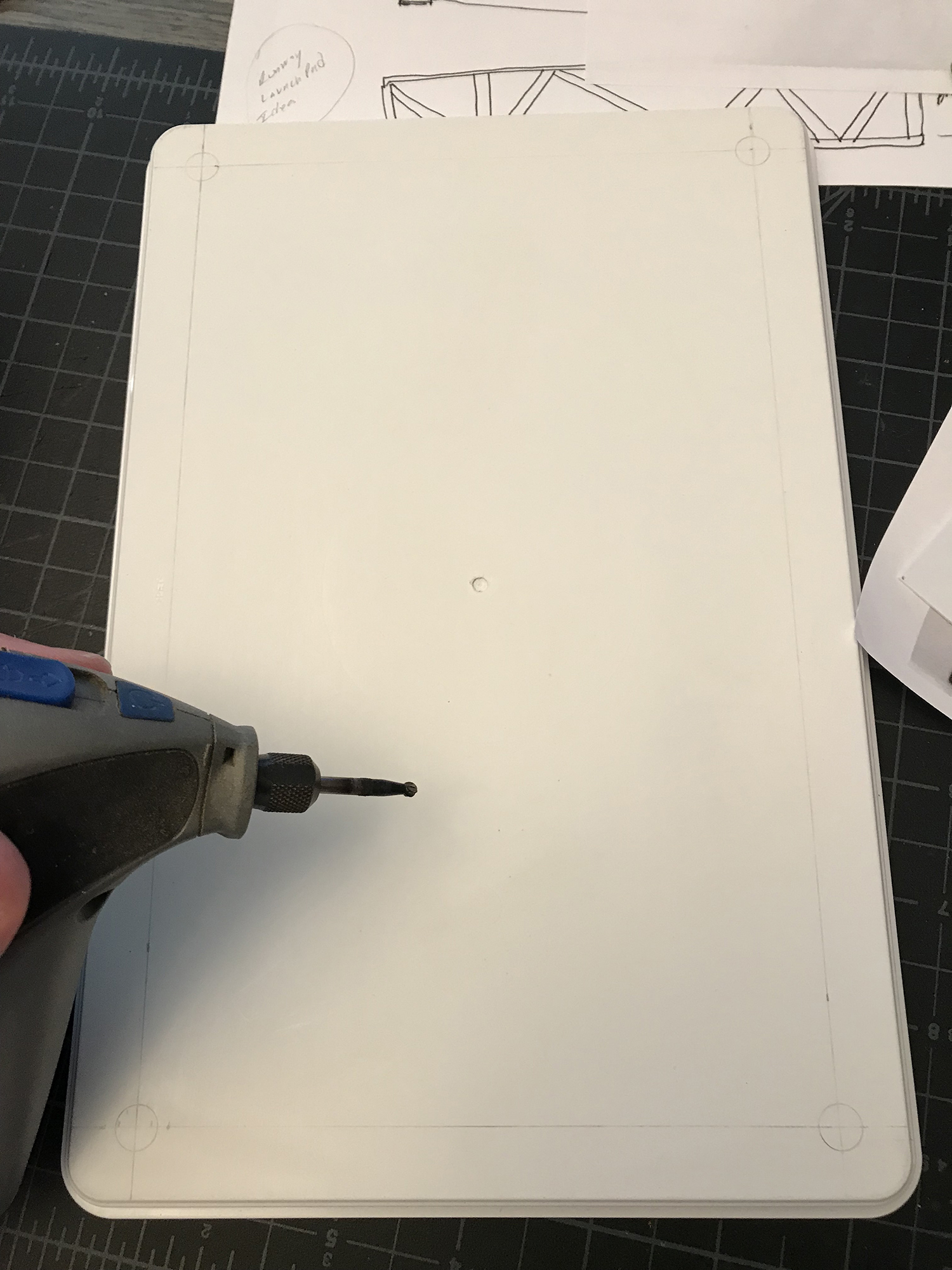
I decided to use an Ikea storage been lid as the bottom base of the launchpad. Using a Dremel, I drilled 4 holes to the base where I intended on inserting my support columns into. In the second photo you can see that I was beginning to think about what sort of additional parts I could put together to create the mechanical look.
BEING RESOURCEFUL
Modifying Lego pieces and scratch-building
Scratch building can become very expensive if you’re buying polystyrene for a large scale project. On top of that, you may not find the right type of pla-plate (plastic plate) that you’re looking for. In my case I needed to save both time and money and started looking around the house for materials I could modify to build my diorama.
I grabbed a huge bin of Lego parts I had and started to sand and glue pieces together. Quickly, noticed that it was very easy to work with, so I ran with it.
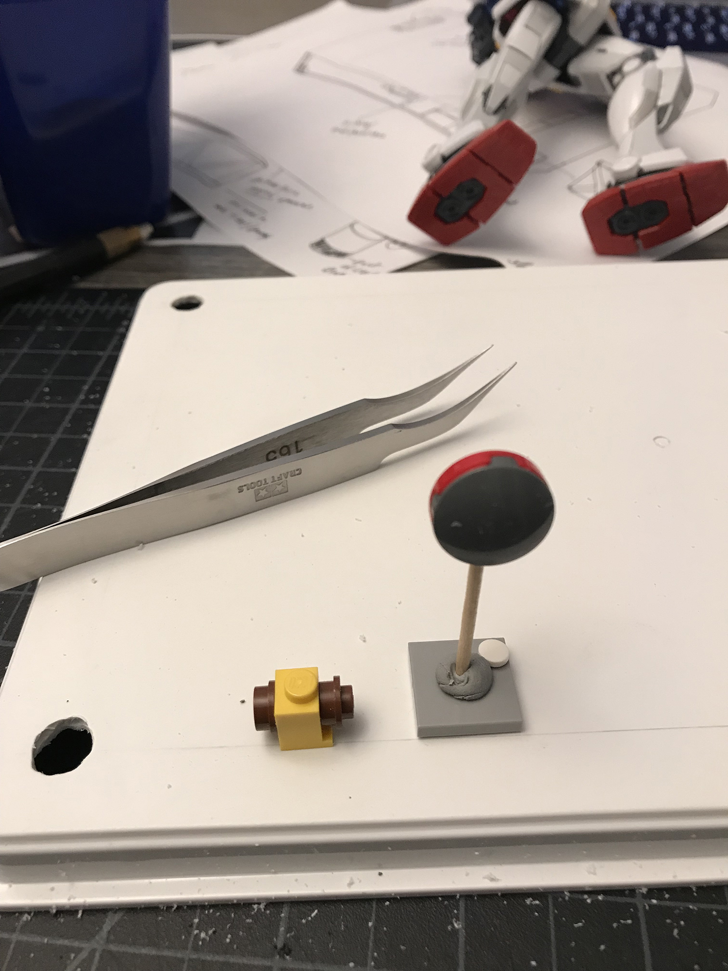
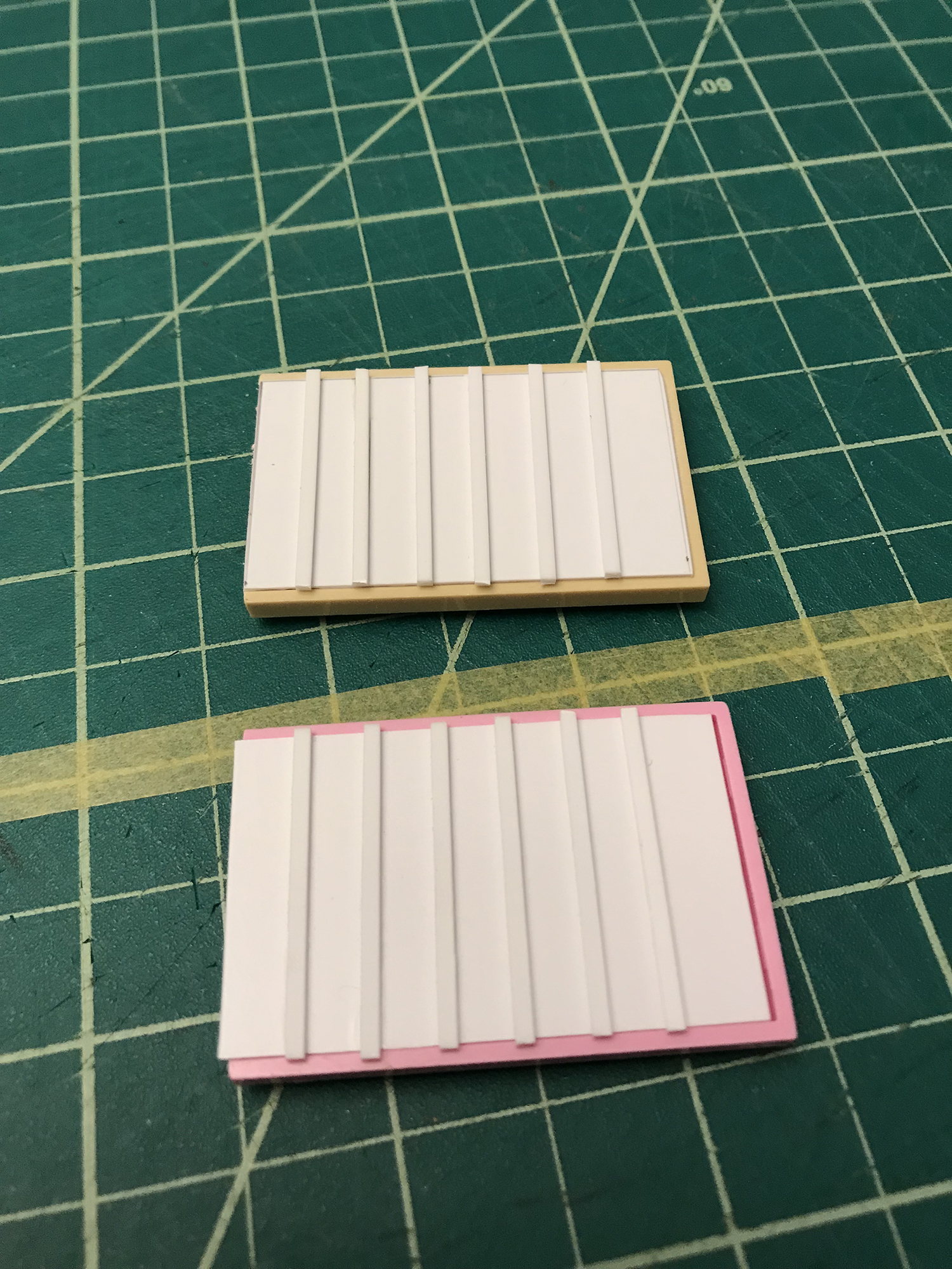
I sawed off and sanded away some Lego parts and used putty to seal up the holes to get a flat part that could then be used as the base for the thrusters. I then constructed the upper portion using a piece of pla-plate and added some some strips to create a ridged texture for the base of the feet to stand on.
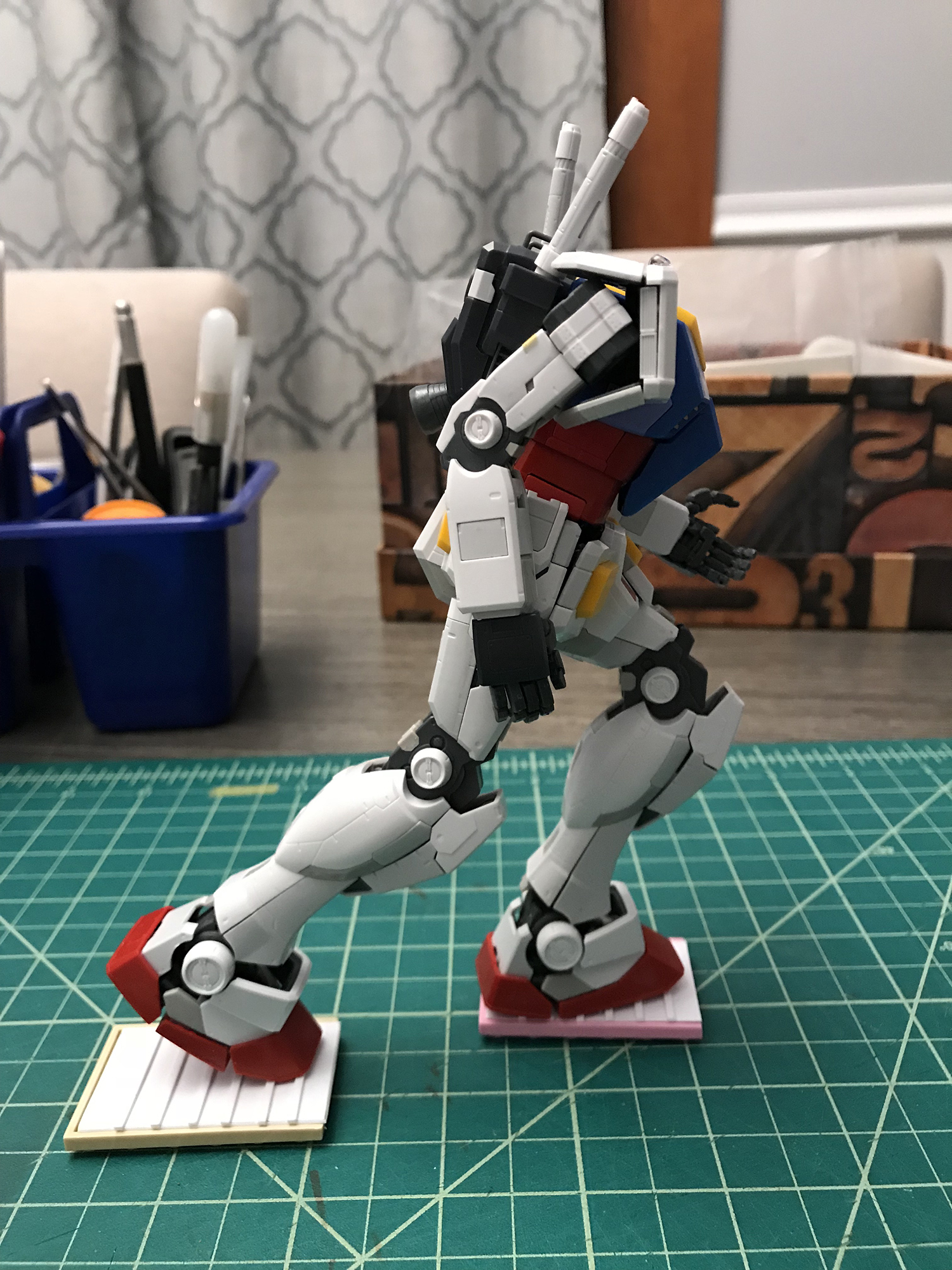
Doing a quick pose for proportion and test fitting.
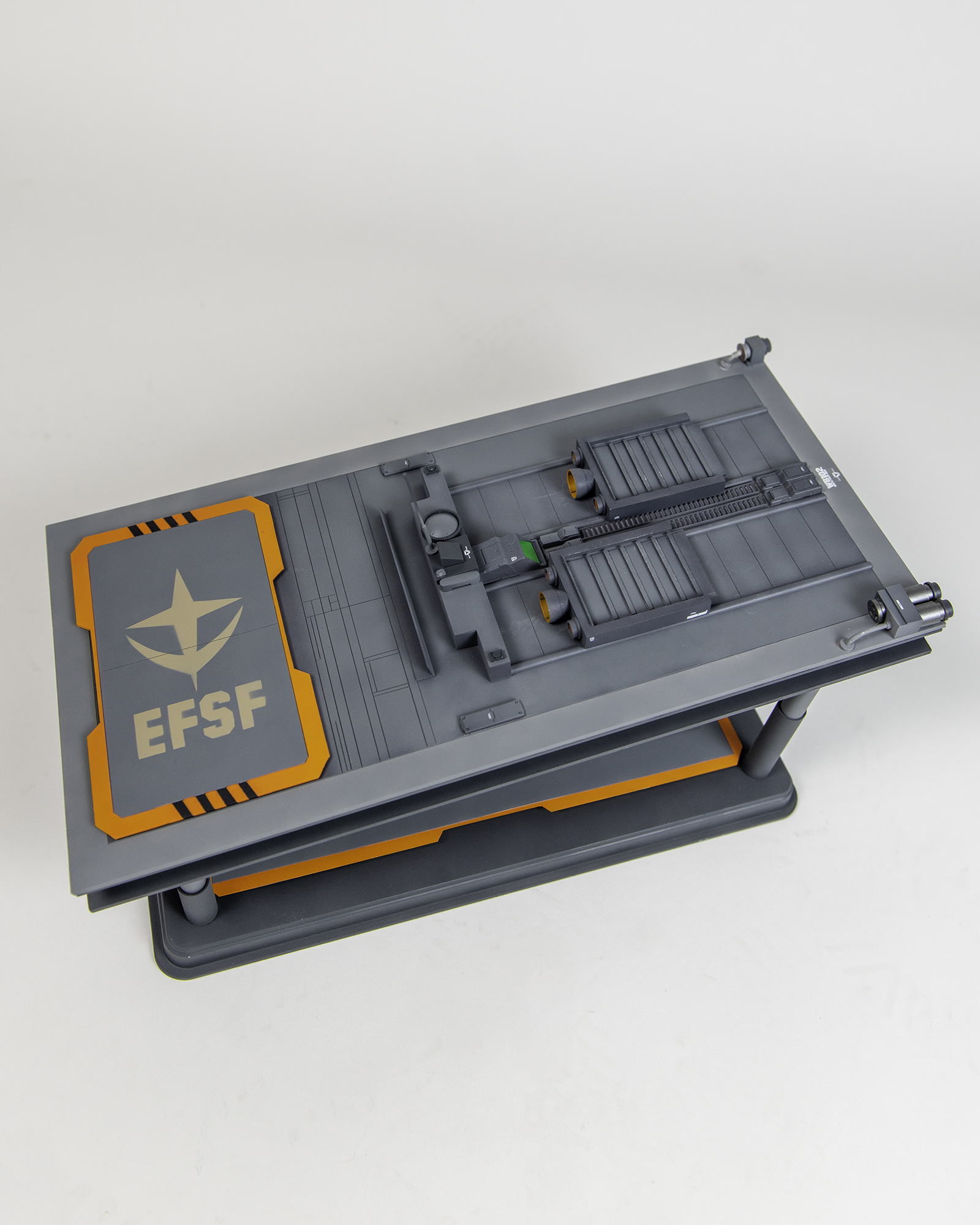
Now came time to start measuring and cutting out the top portion that would be the actual top floor of the base. I wanted to create a small sort of landing pad on the back of the diorama that would serve as a detailed landing zone for the core fighter, or any other small spacecraft. I also had the initial idea that I would stencil the E.F.S.F (Earth Federation Space Force) insignia onto it.
I also used a thicker piece of pla-plate to ensure it had a sturdy look. This was fundamental for me. Understanding that there needs to be varying thicknesses throughout the platform in the usage of pla-plates is what will add depth to the overall look.
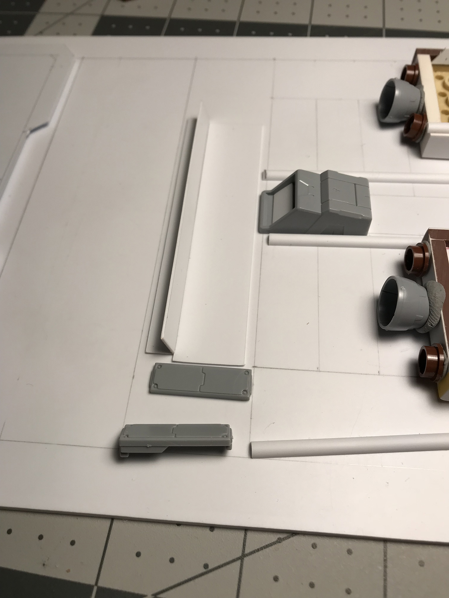
Doing a test run on how things will be laid out and work together. Pictured on the right: Here I’m putting together the rail lines for the direction in which the thrusters will “move”. Measurement and spacing was key here. Keeping things equally spaced will create a symmetrical balanced look. Sidenote: The putty you see is used to hold the parts together before gluing. This allows me to me to make any further adjustments I feel I need to make.
PROGRESS
Revisions to the modifications
The angle is looking pretty good, but the overall look feels a bit thin and light. I went to my local hobby shop in search of something to bulk up the appearance of the diorama and saw some “I” beams that I thought would be very useful as support pieces on the sides. Underneath the upper level, on top of the columns, was an area I knew needed some shaping up.
The support beam is a great addition, but the columns needed something more. An idea that occurred to me was movement. I thought about adding an inner tube to the columns already in place to look as if they would raise the launchpad upwards, creating more of a “launch” look.
In the back of my mind, as I’m putting the main components of the structure together, I’m still thinking about what sort of details I can add to improve the overall look. Legos, Bandai, Kotobukiya parts, and even a chapstick container were all improvised.
It all looks chaotic and incohesive at first with everything being a different color, but sometimes you have to be able to see the bigger picture and understand that things will look more uniform when primed and painted.
CUSTOM PANELS
Panel lines and scribing
With details being added on the upper level of the diorama, I did not want to neglect the lower portion. So I created some custom panels for texture and depth and scribed in some panel lines. This step requires a lot of patience and time.
REFINING DETAILS
Finalizing the level of integrated components
The diorama is finally starting to have more of a completed refined look! I’ve started to glue things together and have a closer vision to how everything is going to work together and have a real operational look.
COLOR SEPARATION
Masking and stencil work
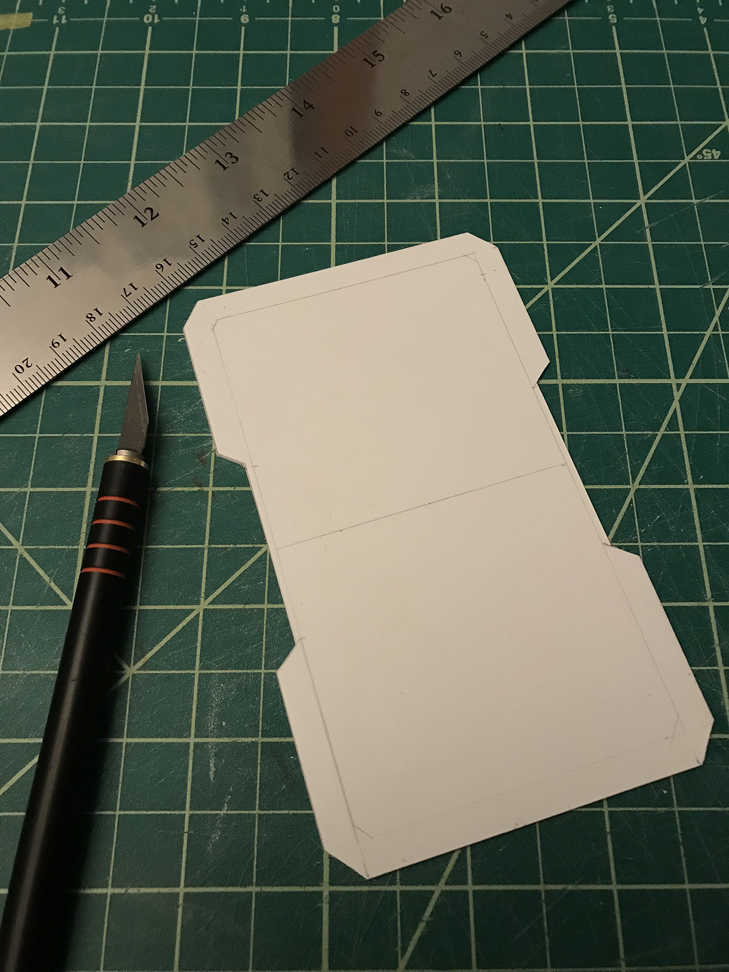
In this step I wanted to do something unique that would make the landing pad standout and have a unique look. I knew that if I wanted to create a uniform look for the stripes I had to make a template to make the lines exactly the same. So I created a stencil out of paper, with specific measurements, to paint the stripes on either side of the landing pad.
I created a template in Adobe Illustrator of the E.F.S.F insiginia and printed it on card stock paper. This is Important: Using some quality heavy paper will allow you to create a sturdy stencil that will be easier to work with, and will also allow you to utilize it in the future.
Another thing to note: If you’re using a stencil to airbrush, you’re going to want to put some weight on the edges so that when you’re airbrushing the power from the airbrush spray doesn’t lift up and give you crude edges. The point is to get crisp edges on the insignia, to make it look as sharp as possible. I noticed after a few trial and errors that when I was painting (airbrushing) the edges of the stencil were coming up from the blow of the pressure from the airbrush. So I used some putty to hold down some metal pellets I often use for mixing my paints.
Quick tip: I painted the center of the the thrusters on the boosters and then used putty to create a barrier for the second color. This allowed me to create a gradient effect and layer different colors on top of each other.
I’m not a huge fan of stickers on model kits, they tend to be thick and noticeable. This MG came with stickers, but I bought some waterslide decals online that were pretty good in quality. Warning: There are A LOT of decals on this kit. Not saying this is the most of any kit, but there are plenty to put in place. It will be very time consuming, and you’re going to want to take your time. You don’t wanna to lose or break one and have to go through the trouble of having to order another set.
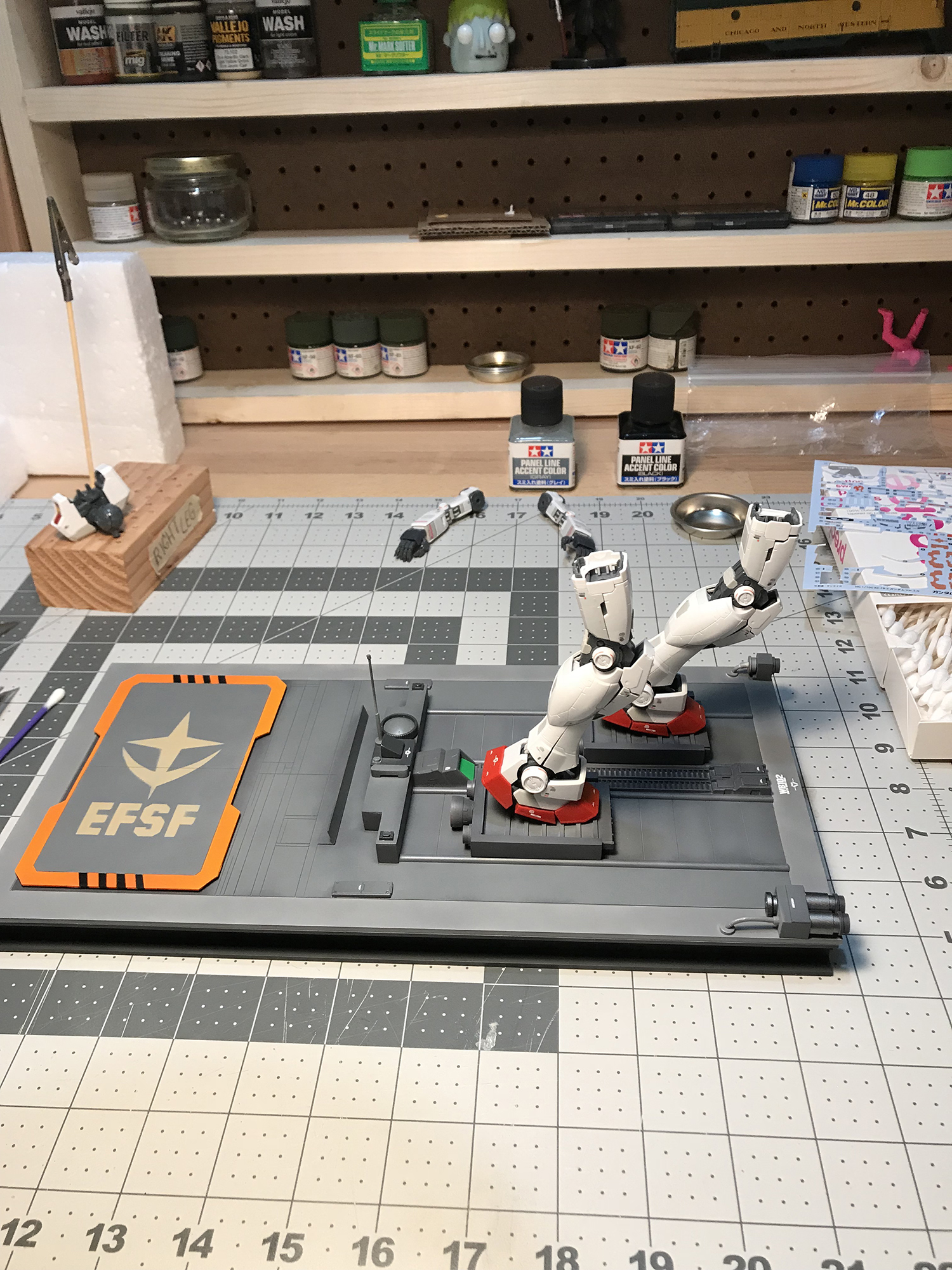
Some paintings been done. The look and feel is set. Now it’s just a matter of adding some details and putting everything together. As you can see from the picture above, there is some gradation in the base color of the launch pad. This was intentional for the purpose of creating some depth in the color scheme.
The masking you see on the cockpit of the core fighter was left on until the final layer of top coat was sprayed on. This is because I was using flat top coat and did not want the “glass” of the cockpit to be dulled down or fog up.
I sprayed a layer of gloss top coat to protect the model from any unforeseen chemical reactions with any of the paints I was using and the plastic. From there I moved on to using a panel wash on the kit to make the details stand out. This can be a bit messy, but if you’re using Tamiya’s panel wash, you can easily clean this up with a Q-tip and a bit of lighter fluid.
Take your time with this step. It’s a very fun step because you start to really see the kit come to life and it’s fun to see the details stand out. However, it’s better to take things nice and slow and work on those details carefully so you can achieve a nice clean look. Unless, you plan on weathering the kit and making it look “battle tested”. Then I suppose it really doesn’t matter much since you will be able to mask those imperfections.
Here’s the kit fully put together, panel lined, top coated with a matte varnish, and water slide decals done. I also purchased and put in place an LED light kit.
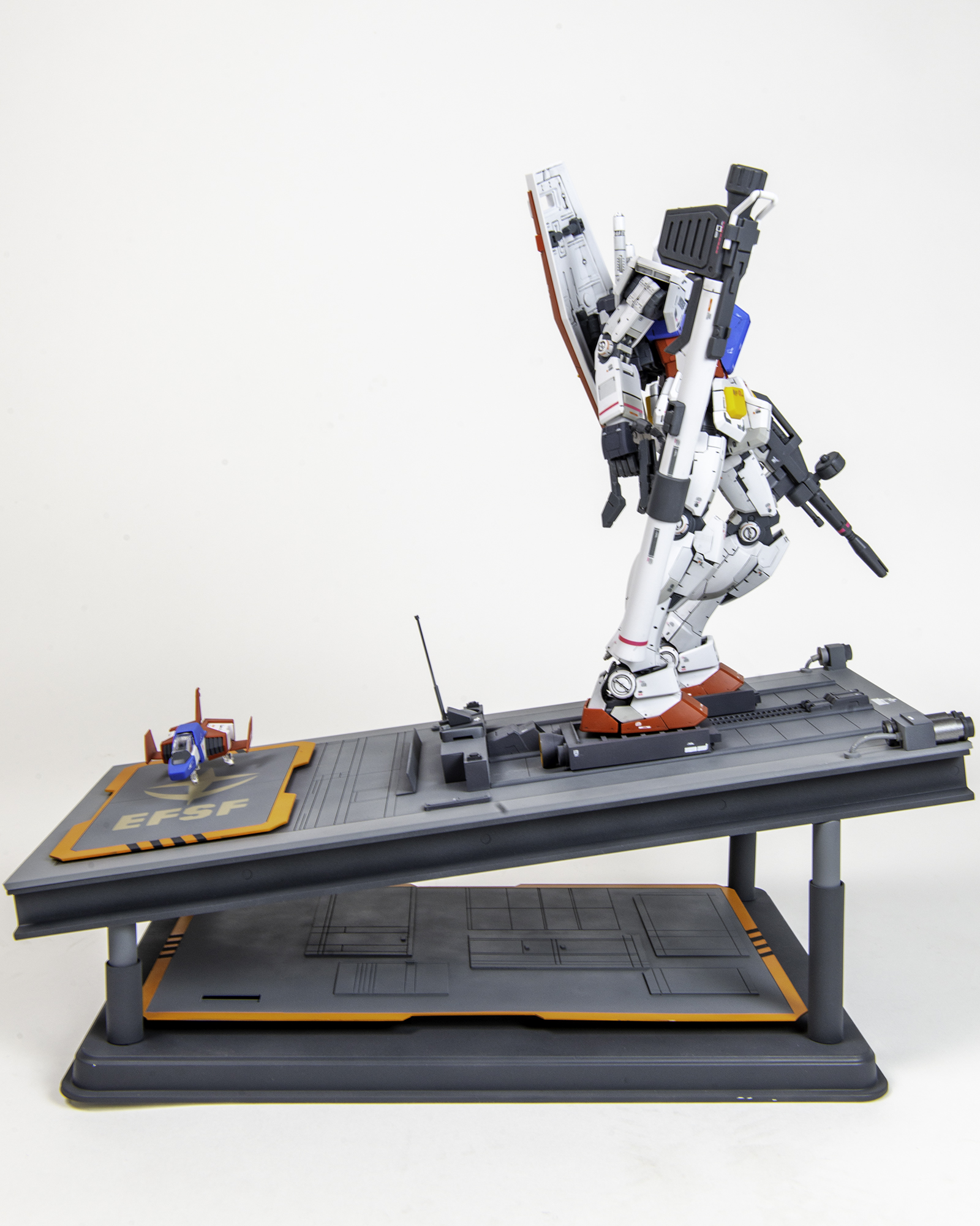
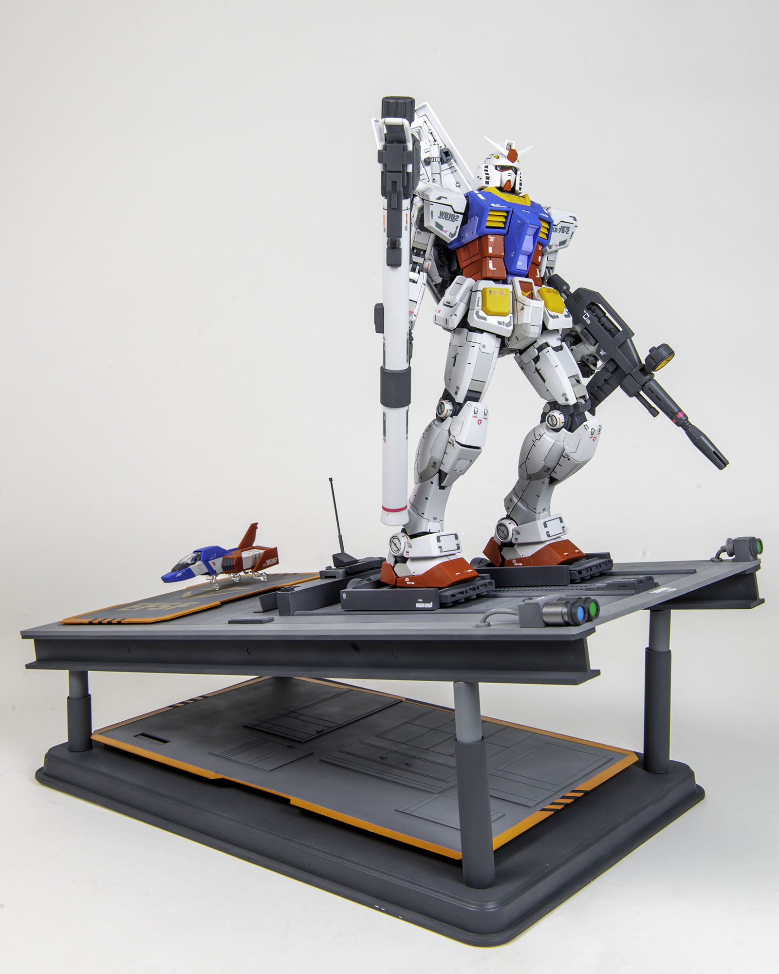
So here is the “launchpad” in completion. There are many things I would have liked to modify and redo, but I ran out of time. This project was a submission for a local Gunpla competition and the deadline was pretty tight. I did not find out about the competition early on, so all in all I had 23 days to acquire and search for the materials, put this whole thing together, photograph, and submit the photos.
One of the biggest challenges for me with this project was learning to work within the constraints of the deadline and knowing what I could actually get done in terms of the vision I had for the project. I wanted to create something amazing, but I knew that time was extremely limited.
Something else I’d like to note is that in the end I was not able to pose the model like I initially intended to. I wanted the model to lean a bit more forward to really make it look like he was propelling forward, being thrusted by the boosters on his feet. Unfortunately, because of the weight of the shield and weapons in hand, it really made the kit unstable and I was not able to balance it properly. I settled for the pose you see above and think that it still came out pretty good.
Here’s a quick video I shot and created to give viewers an additional look at some of the details.


